

If you were searching for a video on how to make your Shopify store mobile-friendly and optimize it for mobile e commerce, then you're in the right place. In this video, I'll tell you how to optimize your Shopify store for mobile devices, so you can provide a better shopping experience to your customers who shop on their phones.
By the way, most people shop on their phones so you definitely don't want to miss this.
Hey there! Today, let's talk about something super important for your online business: optimizing your Shopify store for mobile e-commerce.
Did you know that since 2016, almost 75% of all online purchases have been made using mobile devices? That's a huge chunk of potential sales you don't want to miss out on!
So, let's dive into some simple yet effective steps to make sure your store shines on mobile devices.
And stick around until the end, and I'll even share a bonus tip to take your mobile optimization to the next level.
Ready? Let's go!
Step 1: Choose a Responsive Theme
First things first, pick a Shopify theme that's mobile-responsive. You want your website to look great and work smoothly on all screen sizes, from tiny smartphones to larger tablets.
Luckily, Shopify offers plenty of free and paid themes on their theme marketplace to help you out with this that.
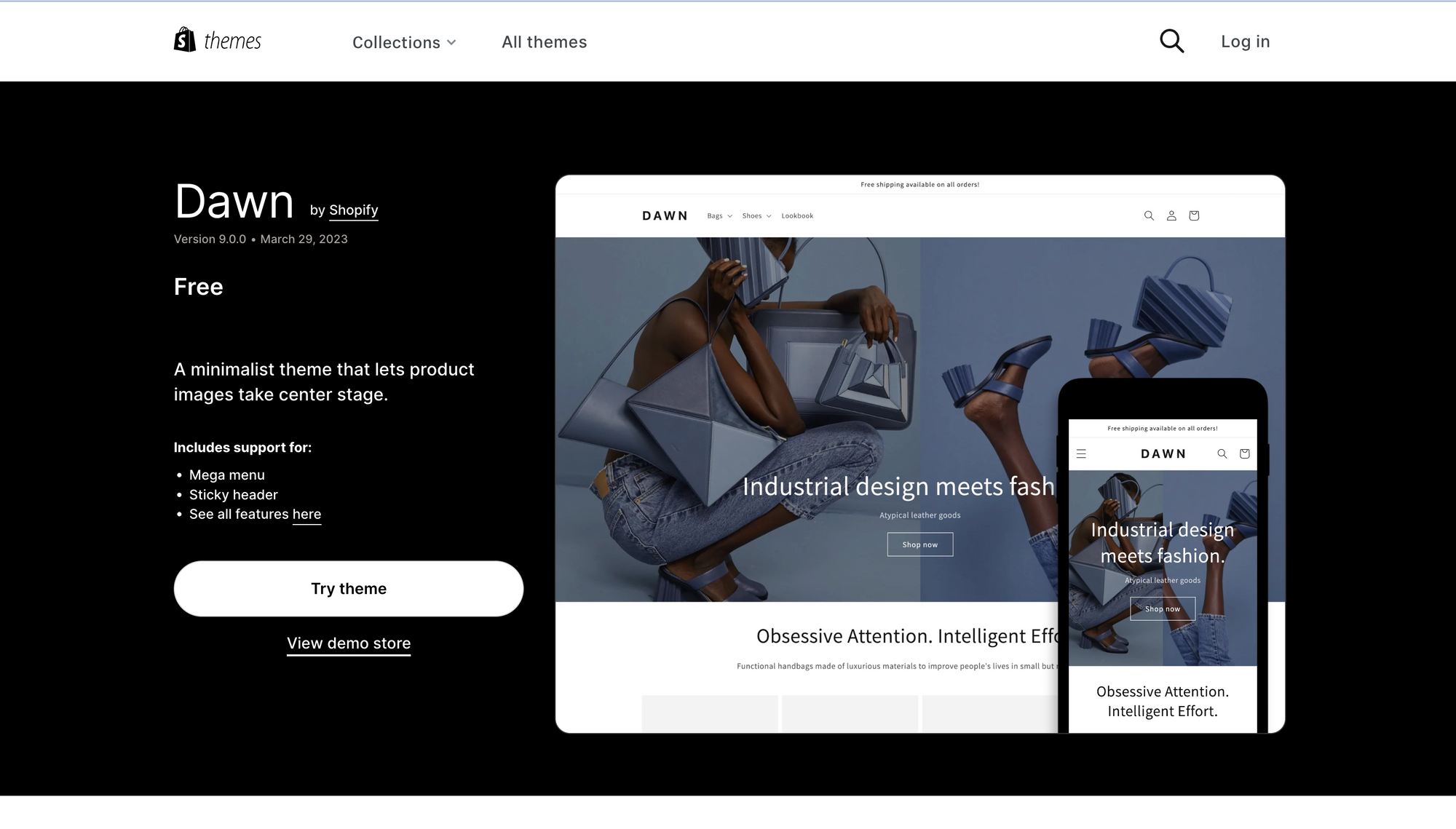
Don't stress too much about choosing the perfect one—go with the popular Shopify Dawn theme if you're unsure.
The Dawn theme is an incredible theme made and maintained by the Shopify Theme Development team and it is the gold standard that all new themes need to meet in order to get submitted into the Shopify Theme Marketplace.
Oh, and if you're interested in a theme from a third-party marketplace like Etsy or Themeforest, double-check that it's mobile-responsive and up to date with Shopify's best practices. Better safe than sorry!
Step 2: Optimize Your Images Now let's talk about images
"You want your store to load lightning-fast on mobile devices, right? Well, that means optimizing your images. Make sure they're not too large and heavy, as they can slow down your site. Resize and compress them to strike the right balance between quality and speed.
You might also want to look into lazyloading. This technique defers the loading of off-screen elements until they are about to come into view, saving valuable loading time and bandwidth.
This means that stuff on your site that the customer can't see yet won't slow down the initial loading of your Shopify store which is great for user experience.
By implementing these strategies, you can significantly improve the speed and performance of your Shopify store on mobile devices. A fast-loading store not only enhances the user experience but also contributes to better search engine rankings and increased customer satisfaction.
Oh, and don't forget to check out our blog post dedicated to optimizing images for more juicy details.
Step 3: Simplify Your Site's Navigation
Ah, navigation—the key to helping your customers find what they need quickly and easily. On mobile screens, space is limited, so keeping things simple is crucial.
Trim down your main navigation menu to the essentials—5 or 6 items should do the trick. If you have lots of links to include, create categories and use dropdown menus or mega menus.
Dropdown menus and mega menus are a great way to add more links to your navigation menus without taking up too much space.
For example, group similar collections under a "Collections" link. By the way, themes like Dawn come with handy dropdown menus and mega menus built right in so make use of that if you have a bunch of links on your site.
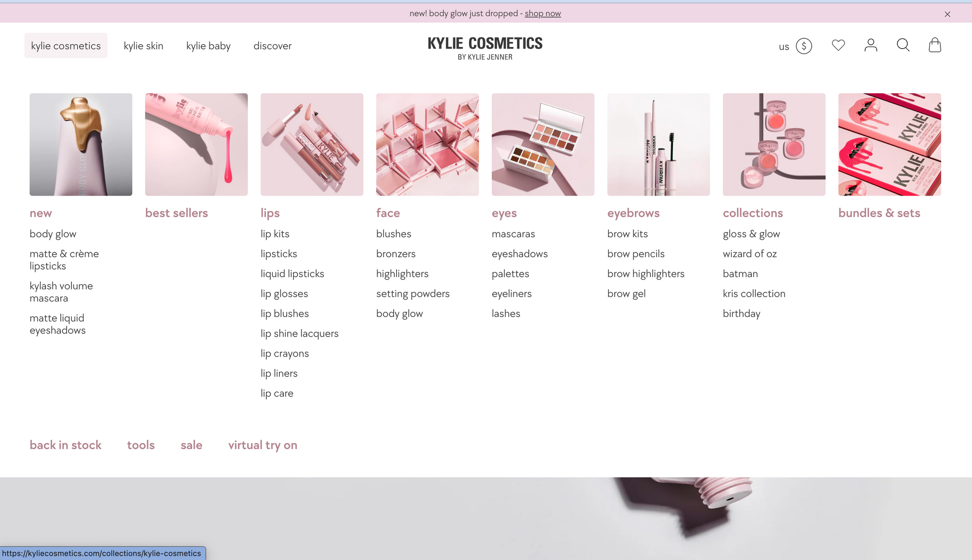
Here is an example of a mega menu used on a popular Shopify site called Kylie Cosmetics.
Here are some other great tips you can use to simplify your site's navigation for mobile devices.
Use clear and concise labels
The labels on your navigation menus should be clear and concise so that customers can easily understand what they do. Avoid using jargon or technical terms that your customers may not understand.
Use high-contrast colors
Use high-contrast colors for your navigation menus so that they stand out from the rest of your website. This will help customers to easily find them.
Make your navigation menus responsive
Your navigation menus should be responsive so that they adapt to different screen sizes. This will ensure that your customers can always find the information they need, no matter what device they are using.
Step 4: Optimize Your Checkout Process
Time to streamline your checkout process for mobile users. Remember, simplicity is key. You want to make it as easy as possible to go through your store's checkout process to ensure that customers have a smooth checkout process.
Here are some tips to optimize your Shopify store's checkout process:
Keep the checkout process short and simple:
Minimize the number of steps required during checkout. The fewer steps there are, the less likely customers are to abandon their carts. Simplify the process by eliminating unnecessary fields and asking for essential information only.
Use clear and concise language:
Communicate instructions and requirements in a straightforward manner. Your customers should be able to understand what they need to do at each step of the checkout process. Avoid using jargon or complex terminology that may confuse or frustrate users.
Highlight important information:
Clearly display key details such as product descriptions, prices, and any additional charges. Customers should have a clear understanding of what they're getting for their money, reducing any doubts or uncertainties during checkout.
Use trust badges:
Display trust badges, such as the Shopify Secure badge, prominently on your checkout page. Trust badges help reassure customers that their information is safe and build confidence in your store's security measures.
Offer a variety of payment options:
Not all customers have the same payment preferences. Provide a range of payment options, including credit cards, PayPal, and Apple Pay, to accommodate different customer needs and increase the chances of completing a purchase.
Giving the customer different options about how they can go through the checkout process increases the likelihood that they will complete their purchase.
Offer a guest checkout option:
Recognize that not everyone wants to create an account just to make a purchase. Include a guest checkout option so that customers can check out without having to create an account. This convenience can improve conversion rates and reduce friction.
Offer a discount for signing up:
Encourage customers to create an account by offering them a discount or other incentives. This can incentivize account creation, which provides benefits such as easier order tracking and personalized recommendations.
Send a confirmation email:
Once a customer has completed their purchase, promptly send them a confirmation email with their order details. This step reinforces their purchase, provides peace of mind, and allows them to review their order information. It also opens a communication channel for any post-purchase inquiries or concerns.
You can also look into using email automation tools such as Klaviyo to provide valuable content and offers to this customer to potentially sell more of your products to them in the future.
By implementing these strategies, you can optimize your Shopify store's checkout process, enhance the user experience, and increase customer satisfaction. Remember, a smooth and efficient checkout process contributes to a positive overall shopping experience, ultimately benefiting your business."
Step 5: Test, Test, Test!
Last but definitely not least, you need to test your site's mobile responsiveness. Grab your phone and put yourself in your customers' shoes. Browse your store, click buttons, and make sure everything works like a charm. Testing is vital, especially when you launch new features or pages. So, make it a habit to give your site a thorough mobile test every now and then.
Bonus Tip: Some Tools You Can Use To Help You Out
Here's a little bonus tip to supercharge your mobile optimization journey. Take advantage of awesome Speed Optimization tools like GT Metrix and Google Lighthouse.
These tools will help you identify any mobile usability issues, such as slow loading times or responsiveness problems. Fixing these issues will enhance the overall user experience, making your store more attractive to both customers and search engines.
Alright, my friend, that wraps up our chat about mobile e-commerce optimization. If you found this helpful, give it a thumbs